The Colors You Choose is Personal
What colors you choose to put on your pallet will decide the fate of each painting and help you create the emotional effect you’re after. I offer you my current pallet recipe as a barometer. A guide if you will, in your own personal creative journey.
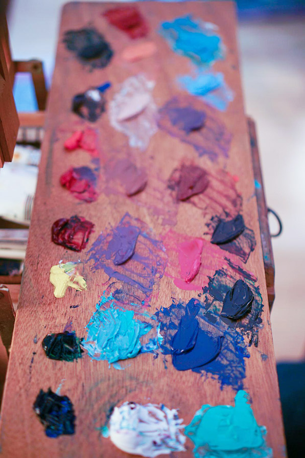
Even though my work is quite colorful, you may be surprised to know that I have always kept my list of pigments between 7 and 10. This forces me to mix almost every color I need, and in return, my colors are naturally harmonious. I find it strange when I see a pallet with 15 – 20 colors displayed like a rainbow across the surface. To me, it’s wasted paint and really not necessary.
The oil pigments on my pallet have changed often over the years. Some pigments fall out of favor with me like Yellow Ochre, Ivory Black and Cadmium Orange while other are discovered along the way; becoming necessary additions to my pallet such Phthalo Green ( Usually $17.00 for 150ml on Amazon) and Bright Red. (Usually $12.00 for 37ml on Amazon)
The reason why some colors fall to the wayside and others take their place is a conundrum. It happens so gradually over the years as I settle into a very personal and exploratory method with my art. Ask me in 2030 what colors I use, and I will likely give you a different answer, because my art is always changing. My artistic growth and timeline
High Chromatic colors
I like to start with saturated and high chromatic colors and dull-down from there. If the color starts off saturated, I can fine tune and mix it down to the desired color. The pigments I choose for my pallet cannot be mixed outright, but are very good mixers and have a “strong tinting power”. Meaning: If the color remains vibrant when you add white, it has “strong tinting power”. These strong and saturated colors can be used to create a myriad of secondary and tertiary colors.
My Top 10 Essential Pigments in 2020:
| Titanium white Bright Red Phthalo green Burnt Umber French Ultramarine Blue | Burnt Sienna Phthalo Blue Alizarin Crimson Permanent Rose Cadmium Yellow |
What, No Black?
You read that right. I don’t use black. Why not?
1) Black flattens out as it dries and is not very rich, or deep.
2) Black is mixable. Save your money.
3) Black out of the tube is more predictable and less interesting than a black you mix yourself.
4) Black should be used to grays down a color, not darken it. If this is the case, mix in a color’s compliment instead for more varied and interesting results.
Try combining pigments to make black instead. A few recipes below: (To test if your mixed black is a true black, take a little from your mixture and add a touch of white to see if it turns gray. If it does, then your black is good!)
Mixing Black Recipes:
- Burnt Umber + French Ultramarine Blue
 Best
Best - Phthalo Green + Alizarin Crimson
- Cadmium Yellow + Phthalo Blue + Permanent Rose
- Phthalo Blue + Burnt Sienna + Alizarin Crimson
Get to Know Your Colors
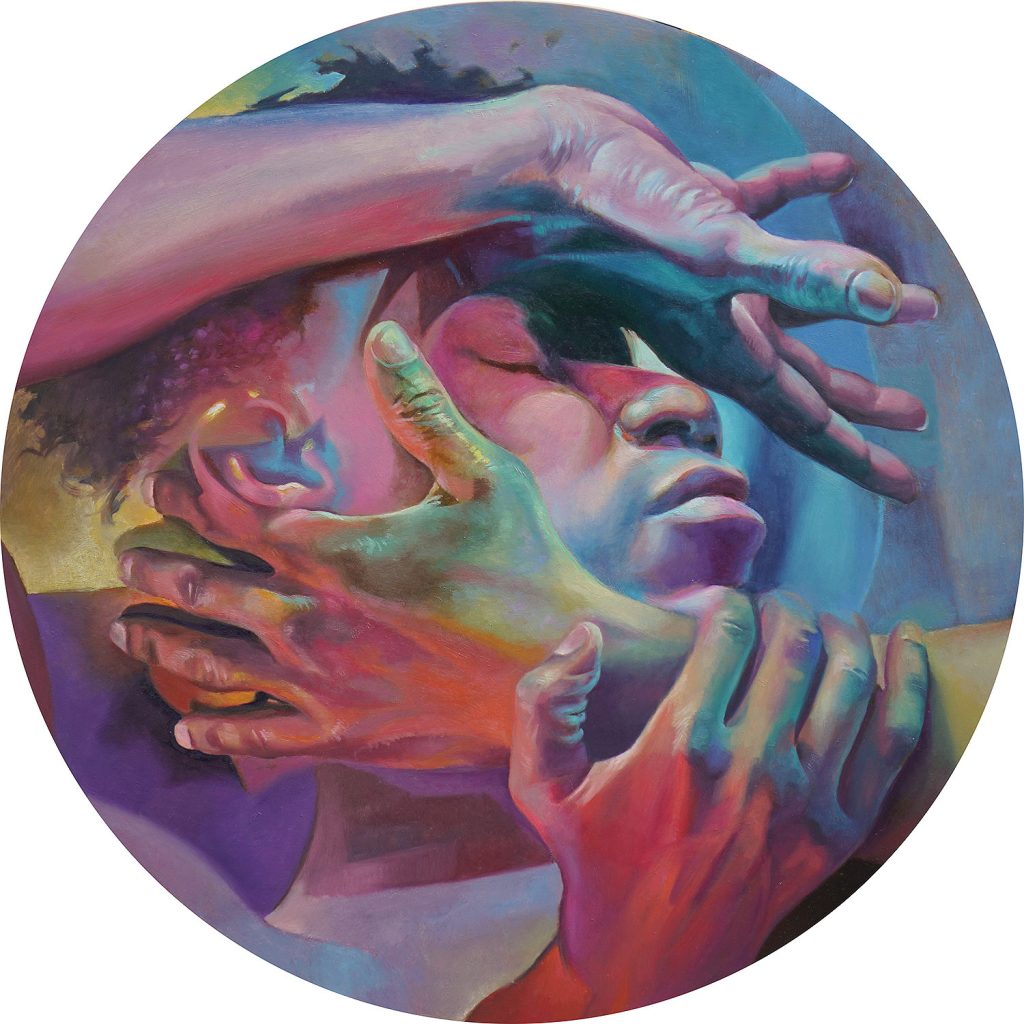
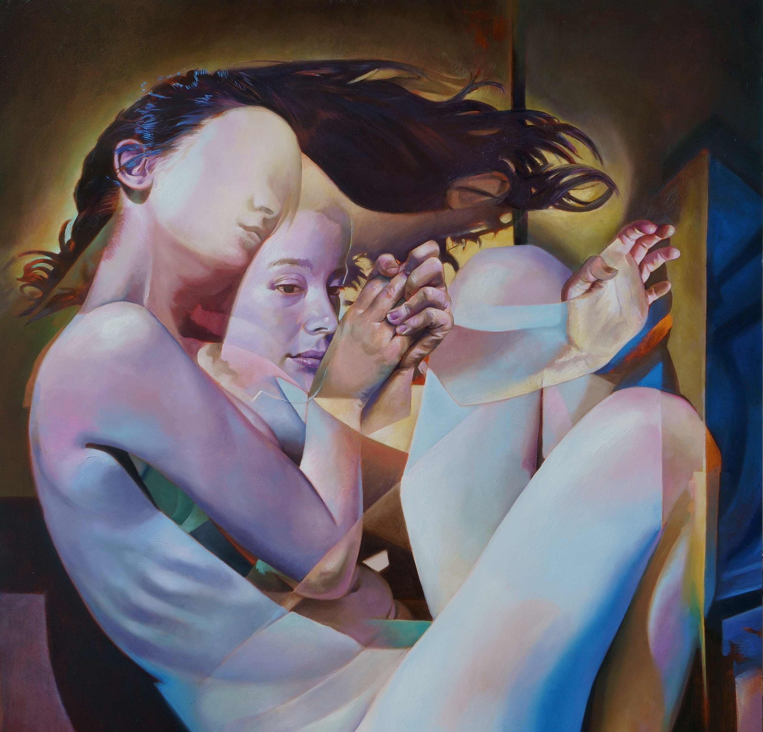
As mentioned above, Color Choice is Personal. So I would like to stress that there is no right or wrong colors you choose to put on your pallet. It really depends on what you are try to accomplish with your color choices. It’s more important that you mix and mix and mix colors so that you experience the way you pigments work. Don’t worry too much if you have purchased the right brand or grade of pigment. For example, the round image above titled ” Letting Go” was painted with both professional and student grade oil paints. It’s not the tools that make the artist.
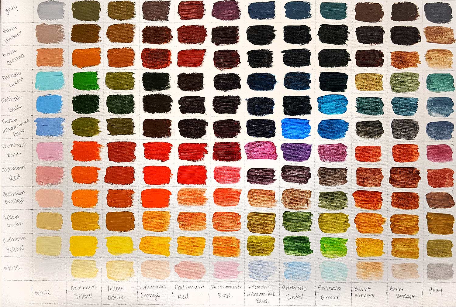
Create a Color Chart
If you want to understand what your colors can do. I highly recommend creating a color chart. Not a color wheel. I find that color wheels have very limited use when you’re finished. However, a color chart can be used as a reference that you can come back to time and time again. Also, the mixing required to finish a color chart of 10 – 15 colors is an education in itself – like the example below from one of the Georgetown University painting courses – mixing colors for this project is very similar to real painting and inspire a clearer understanding of the relationships between pigments and their unique properties.
So I leave you with an assignment…
Color Chart Project – Assignment
My Assignment for you: Creating a color chart using the list of pigments above (or your own pigments from your art box).
1) Lightly make a grid Similar to the chart above.
2) Leave space so you can label your colors in the same order running vertically and horizontally.
3) Then mix and paint in the color in the corresponding box.*
*Notice that the left side of the color chart is repeated on the lower half with the pure hue running diagonally down the middle? The difference between the top half and the lower is that the top half is painted opaquely and the bottom is transparent. (Thin the colors on the lower half with liquin or your preferred medium so the color on the lower half is more transparent.)
If you do this Assignment, send it my way, and with your permission, I will add it to this article!
Hello Scott, really enjoy your website. Trying to create the color chart you have but I don’t understand how it works. Does it work like coordinates where paint color on vertical axis (left) mixed color on horizontal axis (bottom) give color that meets when they cross in middle. Also, you reference the top of the color chart but it seems cut off. I only see a left vertical side, with same colors repeated on bottom horizontal side. I only ask because you mentioned one of the halves being the version with medium.
Good eye! It works exactly how you mentioned. You take the vertical and the horizontal coordinates and place the mixture where they meet. Thank you for your input. I have fixed a few errors you pointed with my phrasing in the post. Good luck!
Thank you Scott. I was a little dense there. Now I get it. Scott do you teach lessons?
I teach at Georgetown University. Nothing at the moment in the online teaching realm, perhaps in the future.